Sinapsis
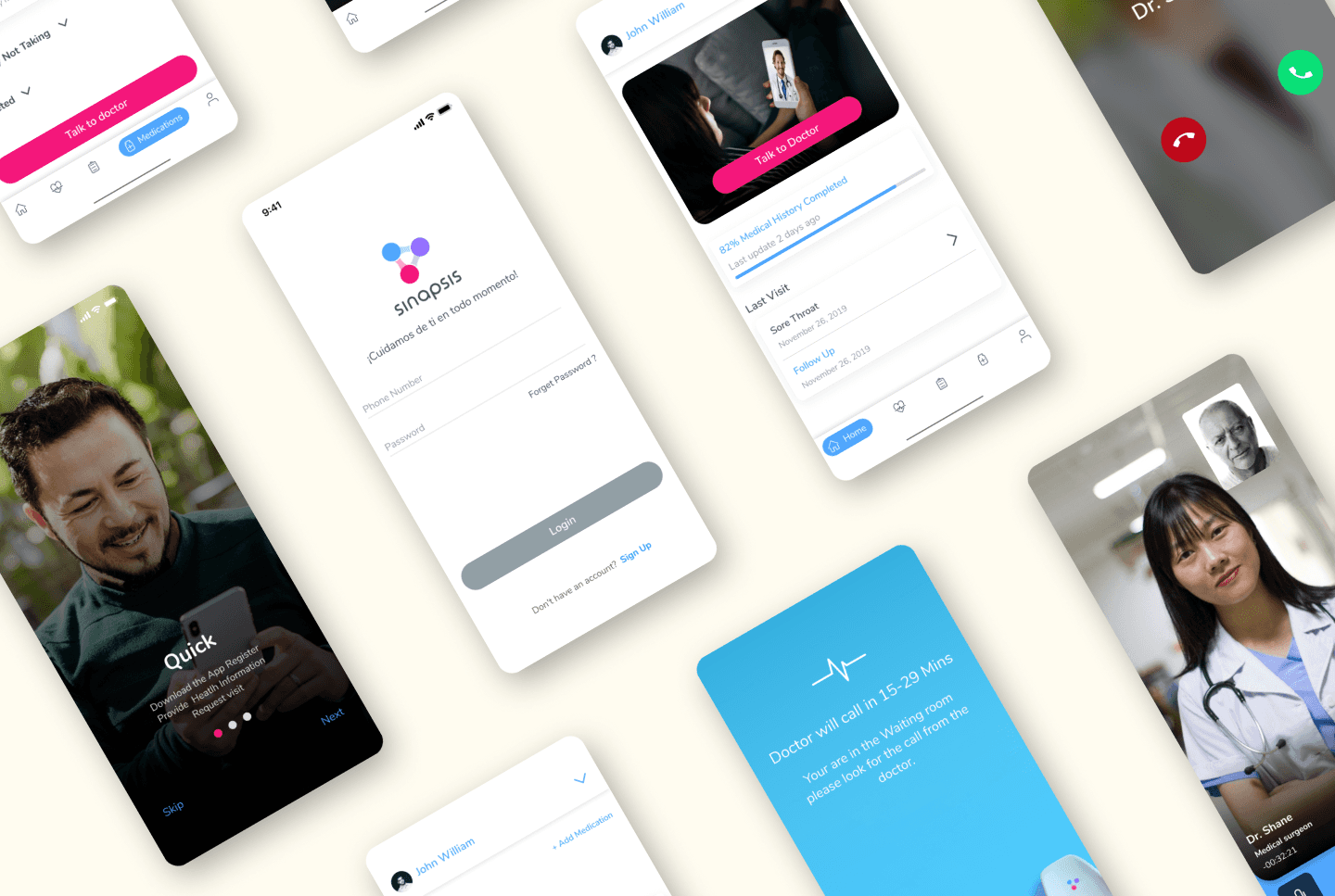
Sinapsis is a virtual healthcare app that helps to connect patients with a doctor virtually on demand.
Project Overview
Sinapsis is a Spanish health care app based in Venezuela which connects patients to a doctor virtually. Initially, Sinapsis launched an MVP patient app and web-based doctor portal to test in the market. Once they determined there was a need in the market, it was time to re-design the front end for a better patient and doctor experience and rebuild the backend for scalability.
Scope of Project:
The project included design and development of three platforms; the patient app (IOS & Android), a doctor portal for the doctors to take the next patient in the queue, use video or voice to perform visit and record the visit history details, and the admin portal for the admin to onboard the doctors and maintain their records.
Activities Performed:
End User Research, Competitor Analysis, Requirements Workshops, Redesign of patient App, doctor web portal and admin web portal and complete back end re-build.
Research Details:
Method Used: Moderated sessions
Number of Participants: 5
Gender Mix: 3 Female, 2 male
Age Range: 23-64
Overview of Moderated sessions:
Patients were observed while requesting a doctor visit and asked to speak out load as the filled in the information requested in the app. They were also asked about their experience once the visit was complete and then asked a day later how they felt about the overall experience.
Results:
Difficult to navigate the app
Did not understand what icons represented
Participants found unresponsive buttons across the app
Finding and adding/editing medical history information was confusing
Adding current medications was ackward
Viewing perscribed medications and diagnosis and doctor notes was difficult to locate after the call
Verbiage across the app was somewhat difficult to understand due to medical language that was not explained further.
There was no way to use the app for more than one family member without mixing medical history and vists.
Participant had to stay in the app in order not to lose their place in line.
Partticpant was confused by contact option screen.
Participants might consider using the app again, mostly for convenience and uniqueness in the specific market
Participants would not recommend the app
Navigation & Icons
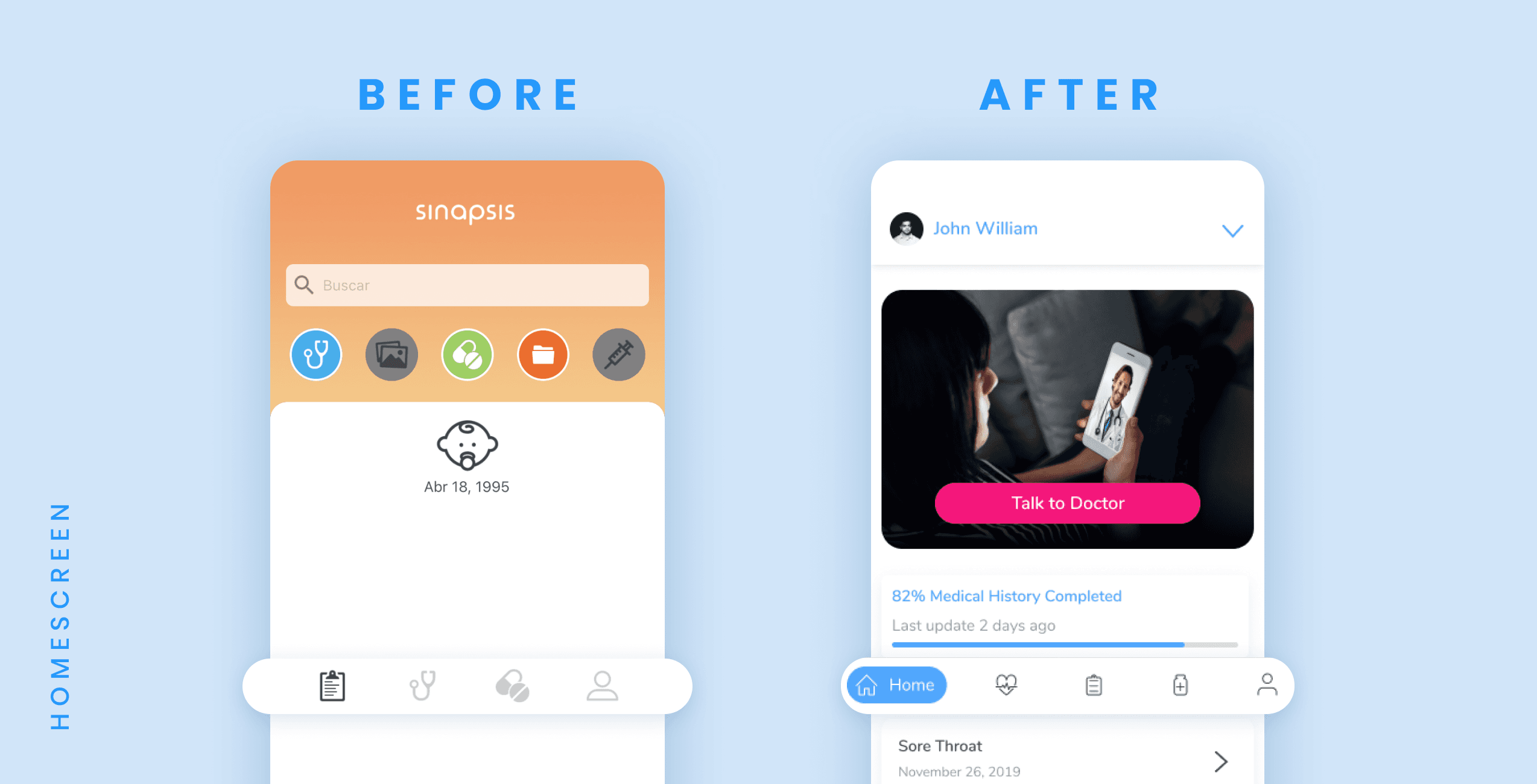
Icons were hard to understand and navigation was overly complicated and confusing.
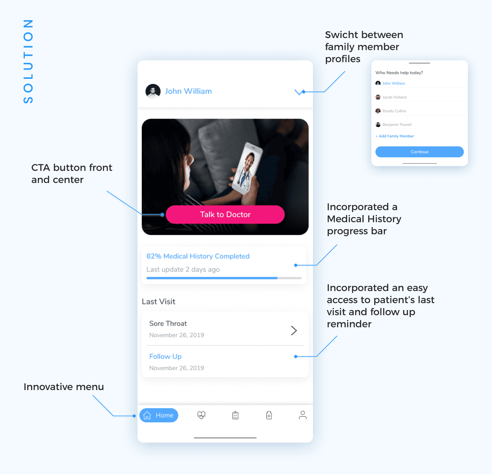
We removed the navigation across the top and re-grouped the icons along the bottom. We divided information into simplier logical groups for medical history, medications, visit history and profile. Then used the top of the home page to put more focus on requesting to speak to a doctor so the main objective of the app could be achieved more quickly.
Requesting to Talk to a Doctor Flow
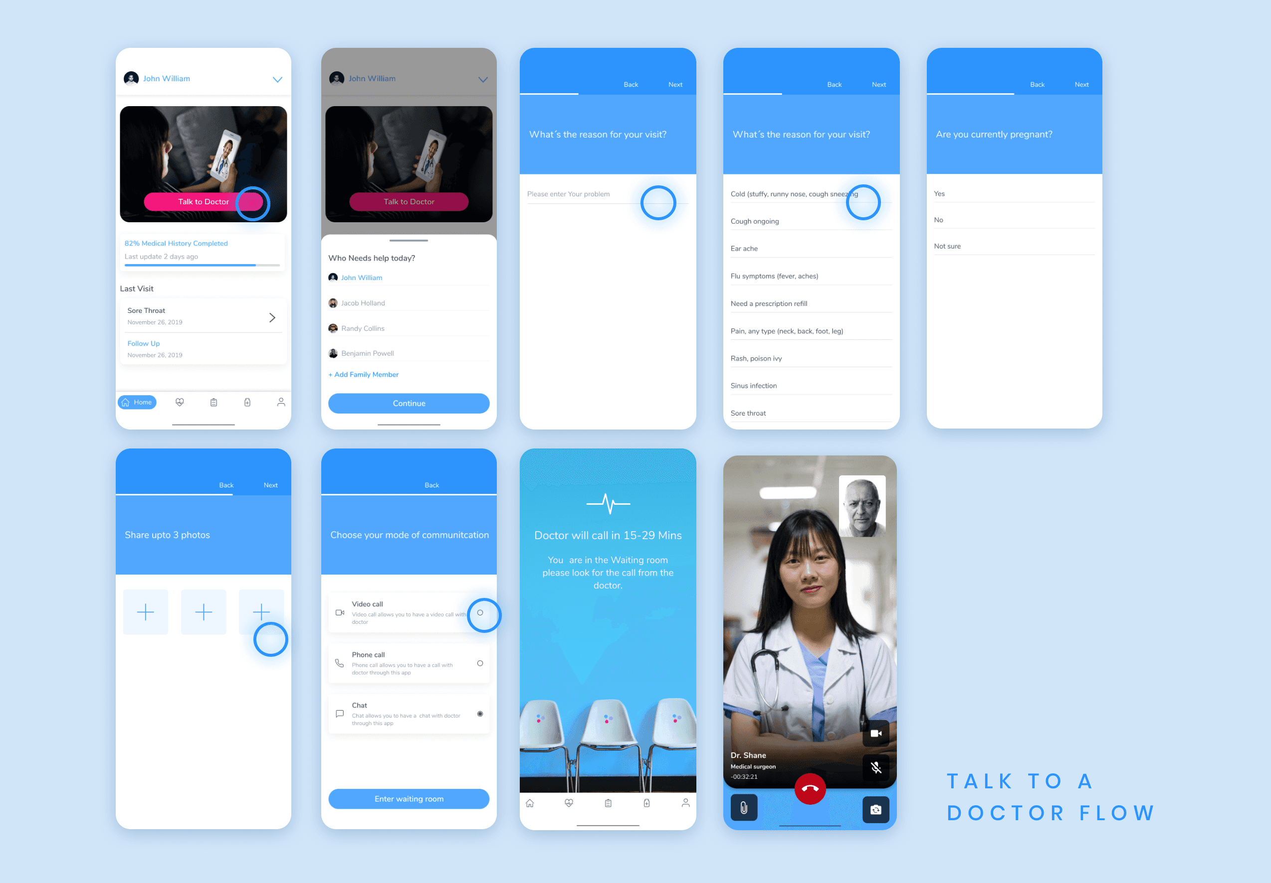
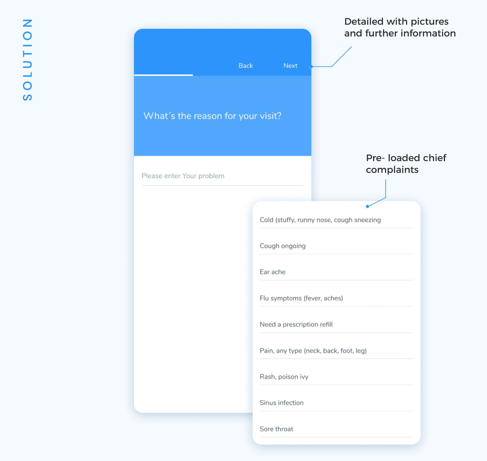
Requesting a visit with a doctor is the focus of the home page and allows the end user to quickly answer questions around their chief complaint and reason for needing to speak to a doctor. They are then placed into a virtual waiting room and can see their approximate wait time.
Chief Complaint/Request Visit
Collecting basic information in order to speak to a doctor was a long process and the chief complaint (reason for request) was a free form field which made the patient intake time consuming once the doctor began the conversation with the patient. Adding a drop down of most frequently used chief complaints made the consultation a quicker process and decreased wait times.
Waiting Room
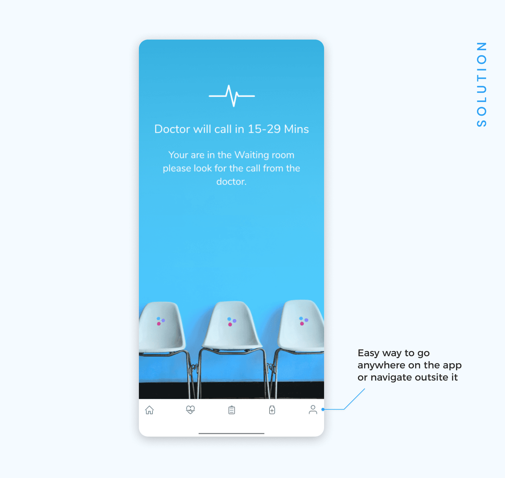
The original design had some short comings when it came to the waiting room. Once a patient requested to speak to a doctor and was waiting, they would lose their place in line if they left the page or closed the app. This was not practical since a new call or text would interupt the wait. The patient also had no indication of how long they would wait to speak to a doctor. The new screen gave them a “virtual” waiting room to let them understand where they were in the process along with the approximate wait time and ability to use their phone as they normally would while not losing their place in line.
Adding Family Members
One of the most significant improvements we made in the new design was for adding family members. The old design did not account for a parent requesting to speak to a doctor for their child. The doctor would have to note which patient they saw in the visit summary. This was not ideal because the app was based on a single profile so the medical history would belong to the parent while the visit summary was for the child.
Medications
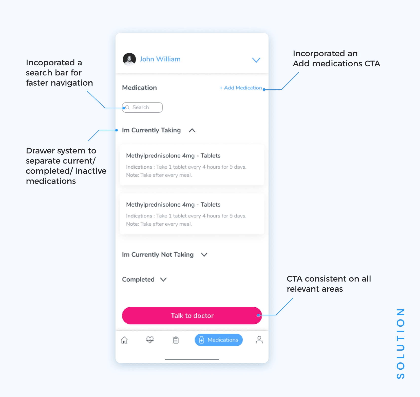
Before the redesign, there was no way for a patient to add a medication they were taking. Only the doctor could add medications which made the consults longer than necessary. the adidtion of the Add medication CTA corrected that issue. There was no way to categorize the medication list to see what medications were current vs perscribed but never taken vs what was perscribed and completed as per the treament course. The category draws solved for that issue.
Doctor Portal
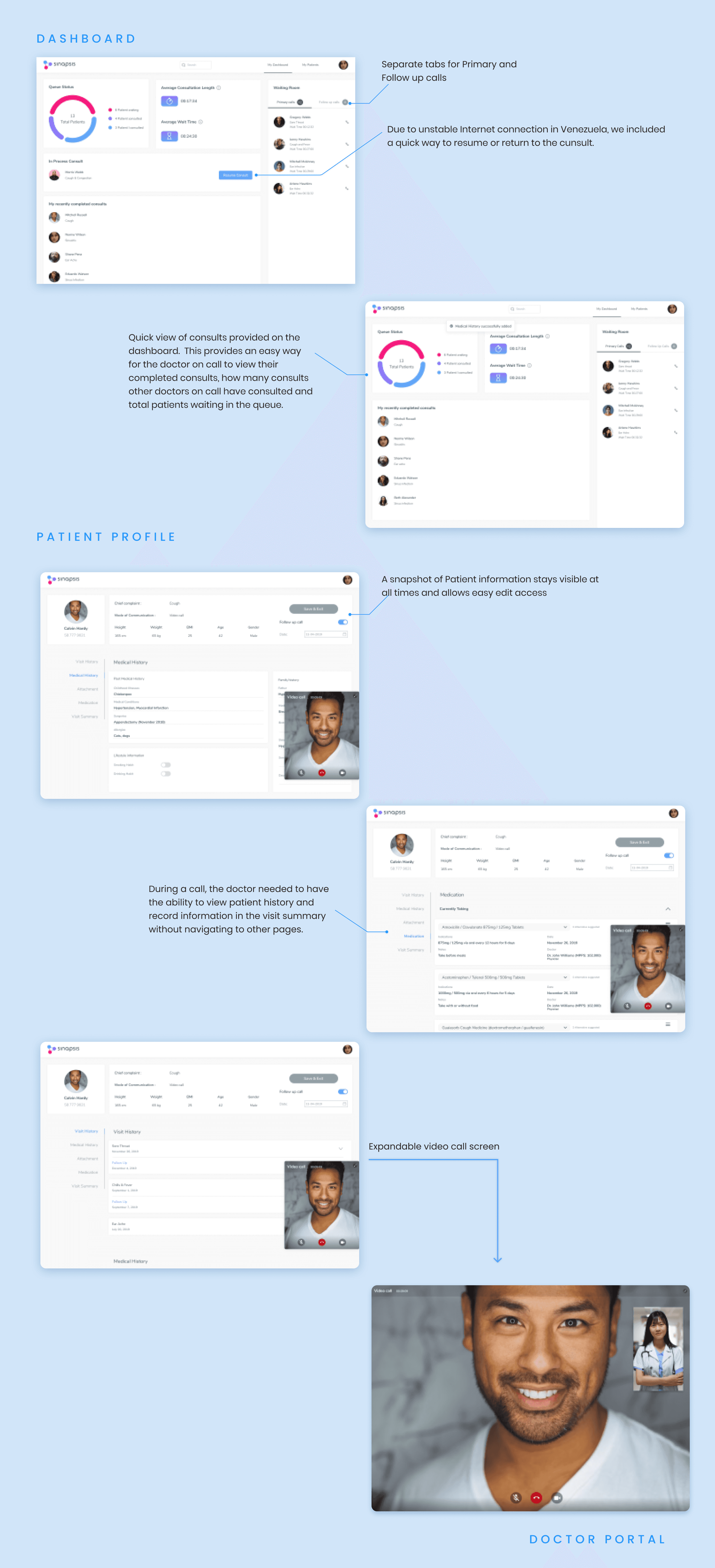
The doctor portal allows doctors providing virtual consultations to patients for common ailments as well as organizes follow up calls to ensure the patient experience completes a full cycle.
Insights
⬆️ Signup process is simplified and transparent about privacy
Multiple family members can be added and selected per visit
⬆️ Easy to track medicine, visit history and medical history per family member
⬆️ Simplified and faster way to connect to the doctor
Patient has a virtual waiting room that lets them know how long their wait is and they can Navigate away from the app without losing their place in line.
More good stuff
See all works

Ready to take your brand to the next level ?
Transforming Ideas into Impactful Products. Let's Collaborate on Your Next Innovation!
Start a project
Get in Touch
linkedin.com/in/sanjith1/

sanjithb9@gmail.com
+91 8122523231
Crafting since 2015
